
Visual aids are powerful tools for enhancing the quality of your term paper. They can clarify complex ideas, emphasize key points, and make your research more engaging for readers. However, using visuals effectively requires careful planning and execution to ensure they complement rather than distract from your content.
In this guide, we’ll explore strategies for incorporating visual aids into your term paper to strengthen your arguments and leave a lasting impression.
1. Why Use Visual Aids in Your Term Paper?
Visual aids serve multiple purposes in academic writing:
- Clarification: Simplify complex data or concepts with graphs, charts, or diagrams.
- Emphasis: Highlight critical findings or trends.
- Engagement: Break up dense text and maintain reader interest.
- Support: Provide concrete evidence to back your arguments.
Example: A bar graph showing annual carbon emissions supports a paper on climate change by presenting trends visually.
2. Types of Visual Aids to Consider
Different types of visuals serve different purposes. Select the ones that best fit your content and enhance your message.
Common Visual Aids:
- Tables: Present numerical data in an organized format.
- Graphs and Charts: Illustrate trends, comparisons, and relationships.
Example: Line graphs for showing changes over time. - Diagrams: Explain processes or structures.
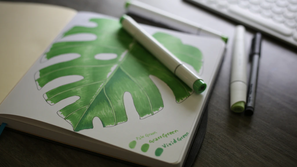
Example: A flowchart to depict a scientific process. - Images and Illustrations: Provide context or visual examples.
Example: A photo of a historical artifact in a history paper. - Infographics: Combine visuals and text for concise, engaging summaries.
3. Choosing the Right Visual for Your Paper
Selecting the right visual depends on the type of data you want to present.
How to Choose:
- Use bar charts or pie charts for comparisons and proportions.
- Opt for line graphs for trends over time.
- Include diagrams to simplify complex systems or processes.
- Add tables for detailed numerical data.
Tip: Avoid overcrowding your paper with visuals—choose quality over quantity.
4. Creating Effective Visuals
Well-designed visuals are clear, concise, and easy to interpret.
Design Tips:
- Keep It Simple: Avoid unnecessary details or overly complex designs.
- Use Labels: Clearly label axes, categories, and data points.
- Include Captions: Add descriptive captions to explain the visual’s relevance.
- Maintain Consistency: Use uniform colors, fonts, and styles throughout.
Example Caption: “Figure 1: Annual Increase in Renewable Energy Adoption (2015–2023).”
Tools for Creating Visuals:
- Excel: For graphs, charts, and tables.
- Canva: For infographics and visually appealing designs.
- Lucidchart: For flowcharts and diagrams.
- Google Sheets: For basic charts and tables.
5. Integrating Visuals Seamlessly
Visuals should support your arguments, not overshadow them.
Integration Strategies:
- Refer to each visual in the text.
Example: “As shown in Figure 2, renewable energy adoption increased by 40% over the last decade.” - Place visuals close to the related text for easy reference.
- Ensure visuals align with the formatting style of your paper (APA, MLA, etc.).
6. Citing Visuals Properly
Always credit the source of any visual that isn’t your own creation to avoid plagiarism.
Citation Tips:
- Include the source in the caption.
Example: “Figure 3: Global CO2 Emissions by Sector (Source: World Bank, 2022).” - Follow your paper’s citation style (APA, MLA, Chicago, etc.) for formatting guidelines.
Tip: If using your own visuals, mention this in the caption (e.g., “Figure 4: Created by the author”).
7. Reviewing the Impact of Your Visuals
Evaluate whether your visuals enhance your paper or create unnecessary distractions.
Checklist for Effective Visuals:
- Is the visual relevant to the argument?
- Does it clarify or emphasize key points?
- Is the design simple and easy to understand?
- Is the visual properly cited and formatted?
8. Common Mistakes to Avoid
While visuals can enhance your paper, misusing them can weaken your impact.
Mistakes to Watch For:
- Overuse: Too many visuals can clutter your paper and confuse readers.
- Irrelevant Content: Including visuals that don’t directly support your arguments.
- Poor Quality: Blurry images or poorly formatted charts detract from professionalism.
Tip: When in doubt, seek college paper help to review your visuals and suggest improvements.
9. When to Seek Professional Help
Creating and integrating visuals can be challenging, especially for data-heavy papers. If you’re struggling, professional services can provide expert assistance.
How Paper Help Services Can Assist:
- Create custom visuals tailored to your data.
- Ensure visuals align with academic formatting standards.
- Offer feedback on how to improve visual integration.
Conclusion: Enhance Your Paper with Visual Aids
When used effectively, visual aids can transform a good term paper into an outstanding one. By choosing the right visuals, designing them clearly, and integrating them seamlessly, you’ll engage your readers and strengthen your arguments.
If you need assistance, consider seeking help writing a paper or professional advice on using visuals. With the right approach, your term paper will not only inform but also captivate your audience.
Start incorporating visual aids into your writing today, and watch your work stand out!